


Objective: Strengthen brand loyalty, increase repeat purchases, and expand customer engagement through a cross-channel seasonal campaign that complements Rambling Caravan’s existing website and aesthetic.
1. Email Campaign Series
Focus: Seasonal storytelling and curated product offerings
Frequency: 3 campaigns per year (Spring, Fall, Holiday)
Audience: Existing customer database
Highlights:
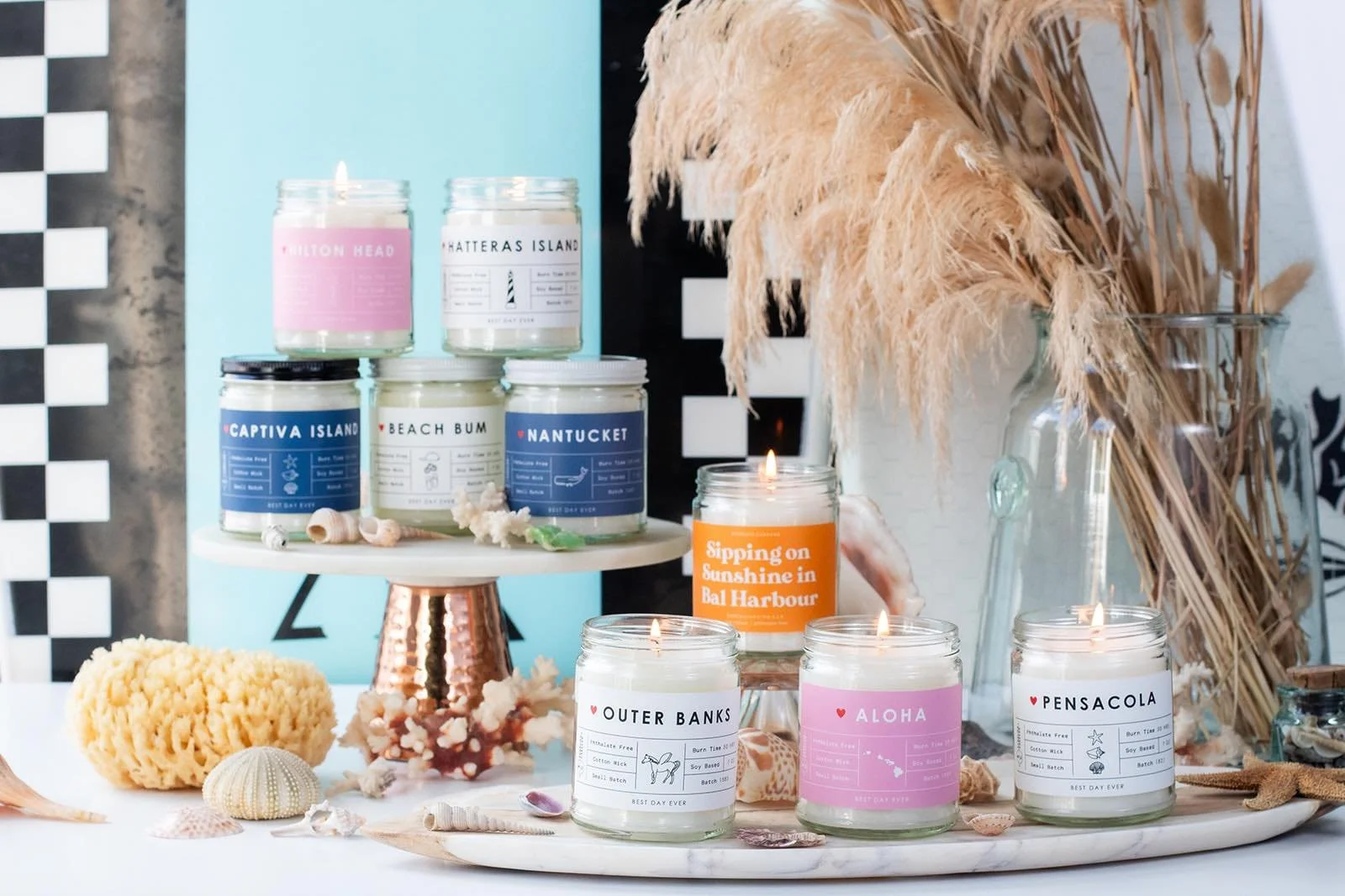
Showcase seasonal collections, new arrivals, and gift bundles tied to each season’s theme (e.g., “Spring Wanderlust,” “Autumn Markets,” “Cozy Caravan Gifts”).
Include short stories or artisan spotlights that reflect the Rambling Caravan lifestyle.
Feature clickable Shop Now buttons that drive directly to the relevant website pages.
Integrate exclusive promo codes or early-access announcements for loyal customers.
Outcome: Converts browsers into repeat buyers while reinforcing brand identity through curated storytelling and visuals.
2. Quarterly Direct Mail Campaign
Format: Postcard or mini-catalog mailer
Distribution: Regional and customer mailing list
Highlights:
4 beautifully designed seasonal mailers that align with the website’s collections and photography.
Each piece highlights featured artisans, new arrivals, or gift ideas with QR codes leading to the corresponding web pages.
Include a loyalty incentive or call-to-action (e.g., “Scan to unlock your spring surprise”).
Outcome: Keeps Rambling Caravan top of mind and drives digital traffic through tangible, memorable touchpoints.
3. Social Media Contest: #MyRamblingCaravan
Concept: Invite customers to share photos using Rambling Caravan products in their daily adventures or home spaces.
Highlights:
Seasonal prompts like “Show us your summer table,” “Your favorite cozy nook,” or “Gifts on the go.”
Encourage posts on Instagram and Facebook with a unique hashtag (#MyRamblingCaravan).
Offer quarterly prizes such as product bundles or digital gift cards.
Outcome: Boosts engagement, generates user-generated content for future campaigns, and deepens community connection.
4. Website Messaging Refresh (Brandiscover™ Model)
Goal: Clarify Rambling Caravan’s brand story and streamline the customer journey.
Approach:
Conduct a brief Brandiscover™ Session to refine messaging for:
Homepage header
Product descriptions and collection pages
About section and brand promise
Email and contest tie-ins
Ensure every page clearly communicates:
The Problem – Overwhelming options for uninspired gifts and décor.
The Guide – Rambling Caravan helps you find pieces with purpose and story.
The Plan – Browse. Discover. Gift beautifully.
The Success – A life filled with artful simplicity and meaningful treasures.
Outcome: A cohesive message that turns casual visitors into loyal, story-driven customers.
Optional Add-On
Seasonal Landing Pages: Create matching seasonal landing pages (e.g., “Spring Collection,” “Holiday Market”) to link the email, direct mail, and contest efforts directly to the online store.
Summary of Deliverables
Email — 3x yearly — Customer retention Seasonal email design & copy
Direct Mail — Quarterly – Awareness & engagement 4 mailer designs
Social Contest – Quarterly – Engagement & UGC Contest strategy, rules, and assets
Website — One-time (with updates) – Conversion optimization Brandiscover™ messaging revamp.

Website Audit: RamblingCaravan.com
(Based on live site review as of October 2025) (Rambling Caravan)
Below are observations and suggestions.
1. Problem — Make the visitor feel understood
What works
The headline “Elevate Your Wanderlust” hints at a lifestyle beyond just candles. (Rambling Caravan)
Copy mentions “small batches … phthalate-free fragrances … cotton and wood wicks” which signals care and quality. (Rambling Caravan)
The menu structure is quite rich; many ways to browse via “Outdoor Adventure,” “Coastal,” “Seasonal,” etc. (Rambling Caravan)
Gaps & opportunities
The primary problem statement isn’t explicit. The homepage doesn’t clearly state “you struggle with finding meaningful, adventure-inspired home fragrance gifts” or something of that nature.
With so many menu categories, visitors might feel overwhelmed or unsure where to start (“Which collection is for me?”).
The “USE CODE: SALE15 … FREE SHIPPING …” banner is generic, and not clearly tied to an emotional pain or desire.
Recommendations
Add a single, concise problem statement under or above the headline “You want your space to reflect your spirit of adventure, but most décor feels generic.”
Use a supporting sub-headline that bridges to solution “Rambling Caravan crafts scented stories in candle form. Find the scent that speaks your journey.”
Limit above-the-fold distractions Instead of menu with dozens of categories, offer a simplified 3-option choice: “Shop by Collection,” “Shop by Destination,” “Custom Gifts.”
2. Guide — Position Rambling Caravan as the empathetic expert
What works
You have an About / Meet the Team section (“Susan Stacy … free-spirited adventure”) that humanizes the brand. (Rambling Caravan)
The blog (“Our Latest Ramblings”) gives lore, storytelling, and helps customers connect with the founder’s journey. (Rambling Caravan)
Product copy highlights features (soy wax, cotton wick, etc.) which supports authority. (Rambling Caravan)
Gaps & opportunities
The “Meet the Team / About” is buried low on homepage — many visitors may never scroll that far — PLUS, a mother/daughter team speaks loudly to your target audience.
The site lacks a clear, repeatable framework (a plan for customers) — “How to get your perfect scent / Gift in 3 steps.”
It’s not obvious how Rambling Caravan differs from other boutique candle brands (beyond “adventure-inspired”, but what does that mean in daily life?).
Recommendations
Elevate the brand story up front. Add a short “Why we exist” or “Our Journey” section early on the homepage with a photo.
Introduce a simple 3-step plan (e.g. 1. Explore your journey, 2. Choose your scent, 3. Light your spirit) and include that near the top.
Clarify unique differentiators — e.g. artisan-crafted, sustainably sourced, travel-inspired, personalized custom options. Use icons to make these stand out.
3. Plan — Provide a clear, low-friction path
What works
You have a robust navigation and many collections to explore. (Rambling Caravan)
Product pages include variants, images, and “Add to Cart.” (Rambling Caravan)
There is a “Custom / Wholesale” call-to-action. (Rambling Caravan)
Gaps & opportunities
The menu has too many choices, which can overwhelm.
Collection pages don’t always guide a visitor “Which product fits me?”
Some internal pages (e.g. “Locations,” “Longitude & Latitude,” “Other”) seem tangential and may distract or confuse. (Rambling Caravan)
Calls-to-action (CTAs) are plentiful but not always compelling or differentiated.
Recommendations
Consolidate navigation. Group many of the subcategories under fewer umbrella labels.
Use “guided navigation” or quizzes. E.g. “Select your vibe: Beach / Mountain / City / Forest” → filter products. (Does Shopify offer this option?)
Consistent CTAs. Use clear, benefit-driven buttons like “Find My Scent,” “Shop the Journey,” or “Gift with Meaning.”
Remove or relocate less critical categories. If “Longitude & Latitude” is more whimsical, consider embedding it deeper or in a “Story / Curiosities” section.
4. Success & Avoiding Failure — Visualize the payoff and the risk
What works
The imagery is high-quality, with a sense of place and ambiance. (Rambling Caravan)
The “Custom Gifts” and “Wholesale” pages imply growth and expansion. (Rambling Caravan)
The blog stories help communicate success narratives.
Gaps & opportunities
I don’t see many customer testimonials or social proof immediately on the homepage.
The “failure” side is not visible (What does the visitor miss out on if they don’t choose a Rambling Caravan product?
The checkout / cart pages are not visible to me from the top of the homepage, so I can’t audit friction there, but often e-commerce sites struggle with clarity in abandonment risk. You may be the victim to their template/wireframe.
Recommendations
Add testimonials / social proof near the top, ideally within the first screen or just below.
Use visuals that show the “after” — a candle-lit space, a gift being unwrapped, someone pausing in their day.
Add subtle cues of urgency or loss (e.g. “Don’t settle for generic fragrance” or “Missed chances to gift with intention”).
On product pages, include reviews, star ratings, and “as seen in” mentions if available.
Other UX, SEO & Conversion Enhancements
Beyond Brandiscover narrative framework, here are additional suggestions:
Hero / Above the Fold Too much “noise” (menu, banner, promos) Streamline — use a single strong image + headline + 1–2 CTAs
Page load / speed (Not measured here) Audit with Google PageSpeed to ensure images, scripts, etc. are optimized
Mobile / responsive Menu might collapse into many sub-levels (risk) Simplify mobile nav; test on various devices
Search / filter UX Many product categories may dilute filtering Implement robust faceted filters (by scent, collection, price, mood)
Imagery consistency Some images feel more editorial than product Maintain consistent brand look (tone, filters, props)
SEO / metadata Some product titles are generic (“Bath Bombs,” “Matches”) Add context: “Rambling Caravan Coastal Bath Bomb — Sea Salt + Jasmine”
Blog / content strategy Blog is active, but maybe disconnected. Use blog content to feed email & social; link products within posts
Footer / trust signals Legal pages, but minimal brand substantiation Add badges (e.g. “Small Batch,” “Sustainably Made”), guarantee, “As Featured In,” press
6. Sample Homepage Wireframe (with Brandiscover™ flow)
Here’s a suggested structure to reorder homepage sections:
Hero section
Background image (cozy, adventurous setting)
Headline: “Let Your Space Tell Your Story”
Subheadline (problem + promise)
CTA: “Discover Your Scent Journey”
3-Step Plan / How it works
(Explore → Choose → Light)
Featured Collections / Journeys
E.g. “Coastal Escapes,” “Mountain Retreat,” “Urban Adventure”
Testimonials / Social Proof
Quotes + user photos (UGC)
About / Brand Origin
Short founder story with photo
Featured Blog / Ramblings
Tie to lifestyle / product mix
Custom / Wholesale (call-out)
Footer
Basic nav, trust badges, newsletter signup, social links